spatial practice architecture office Los Angeles Hong Kong museum plus pavilion art basel hong kong view escalator

M+ Museum Pavilion

Art Basel Hong Kong

2018

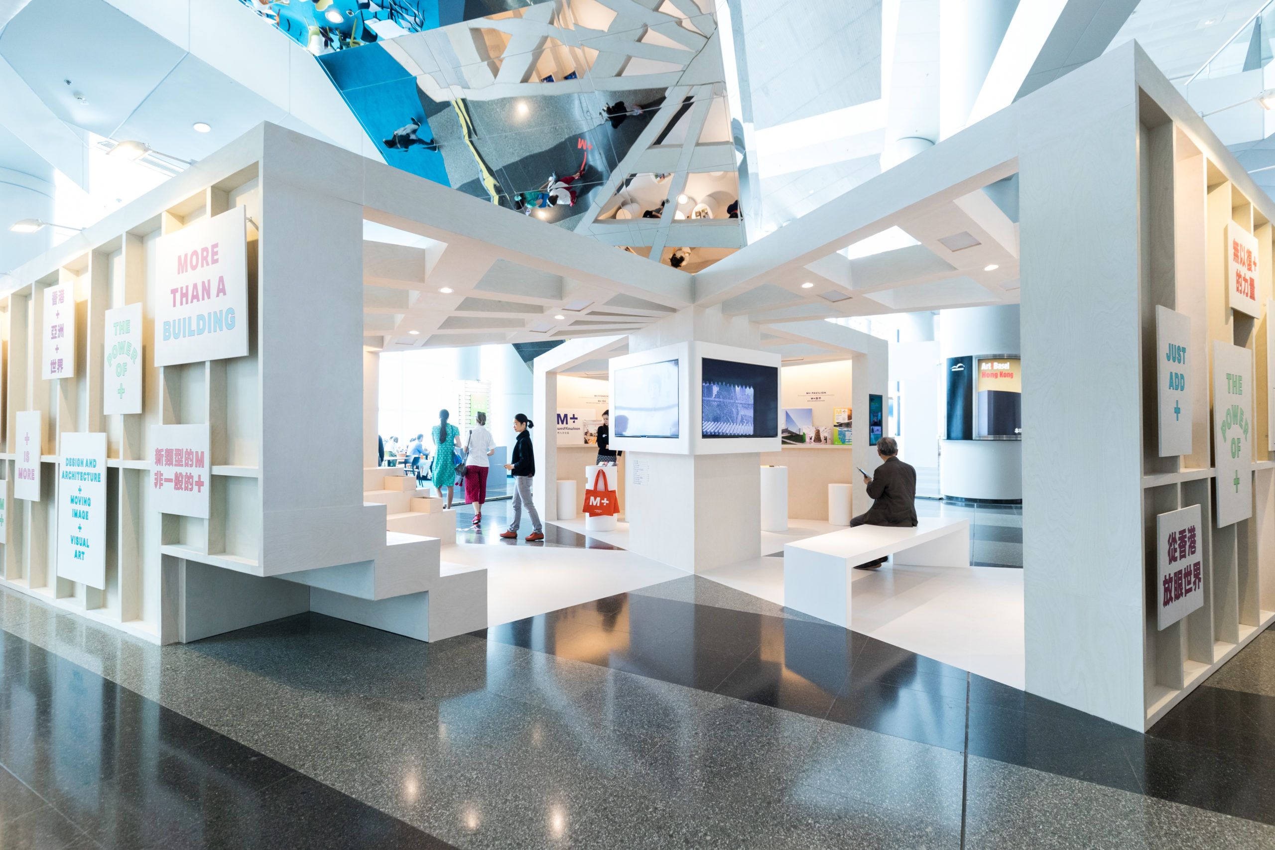
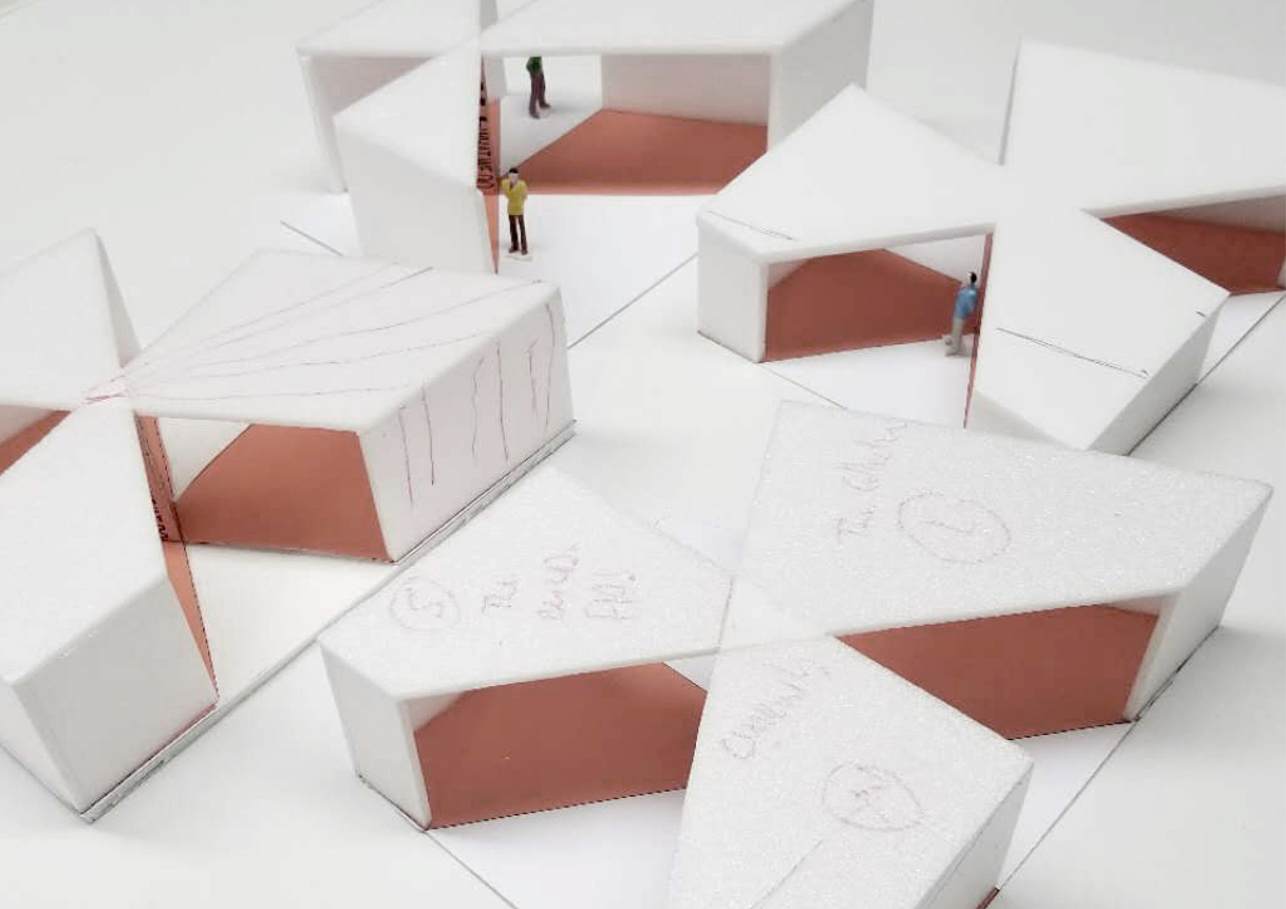
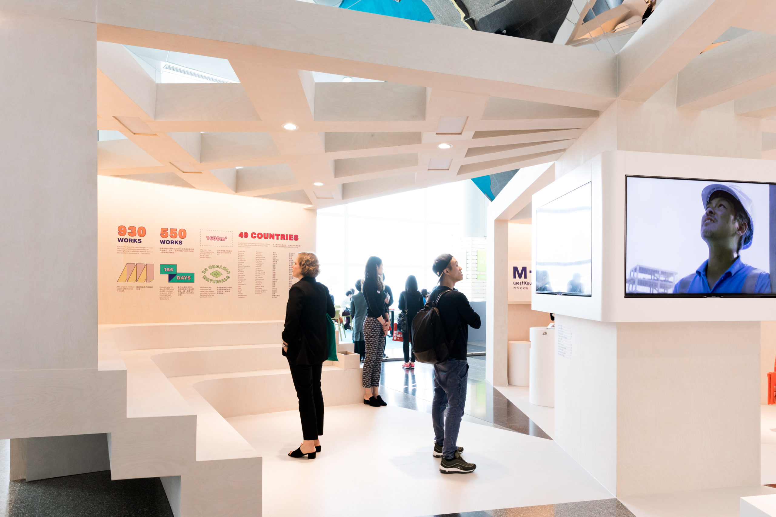
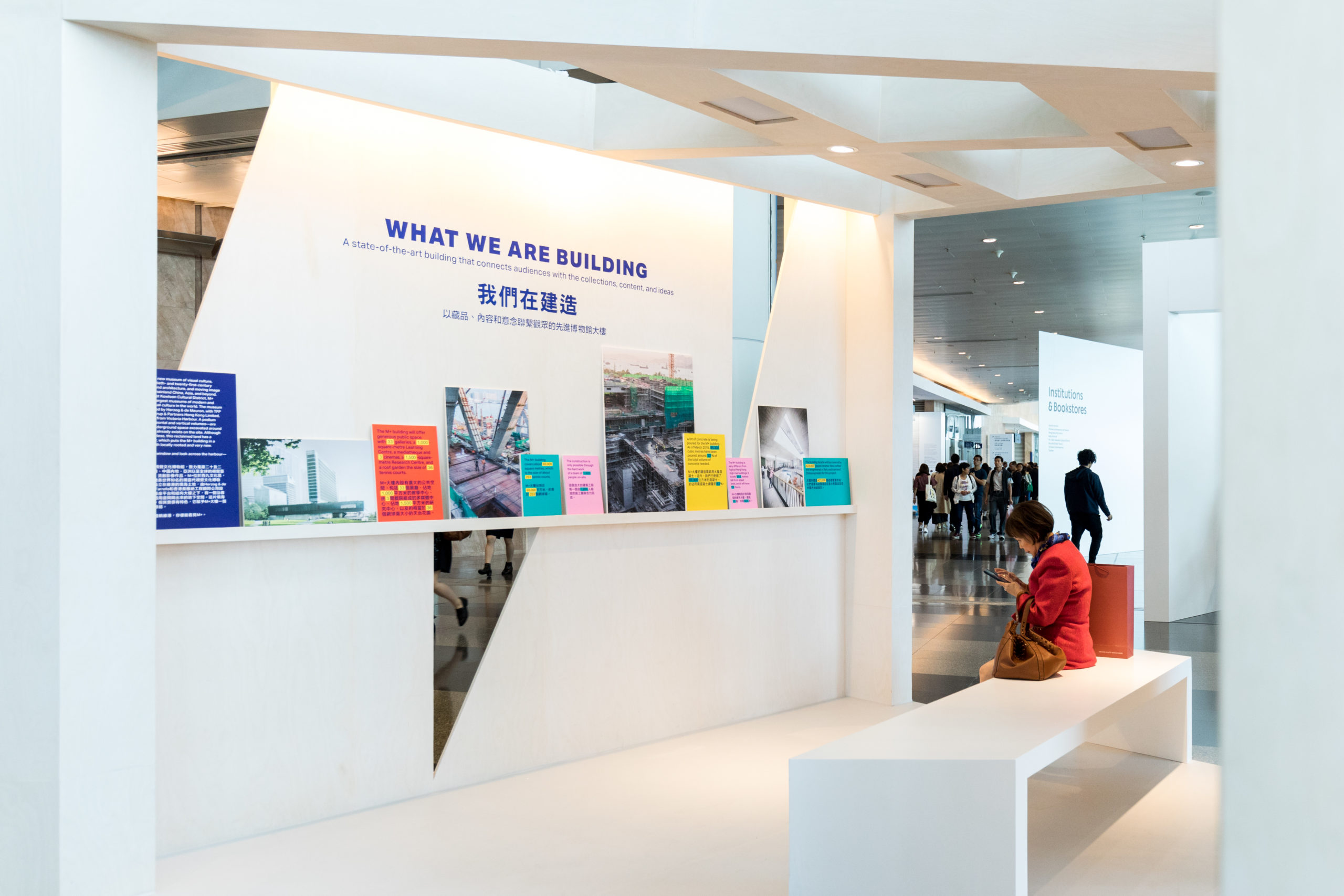
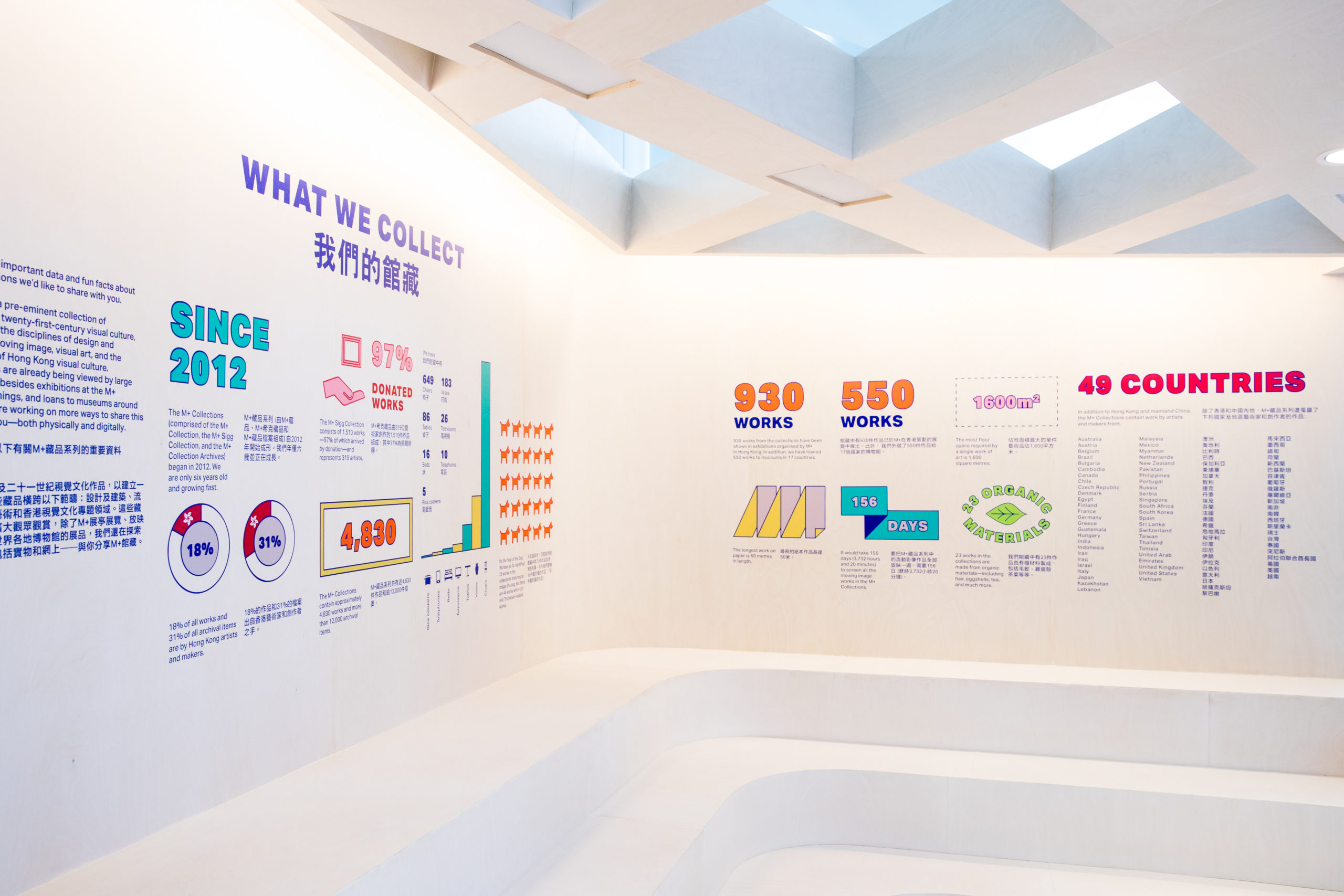
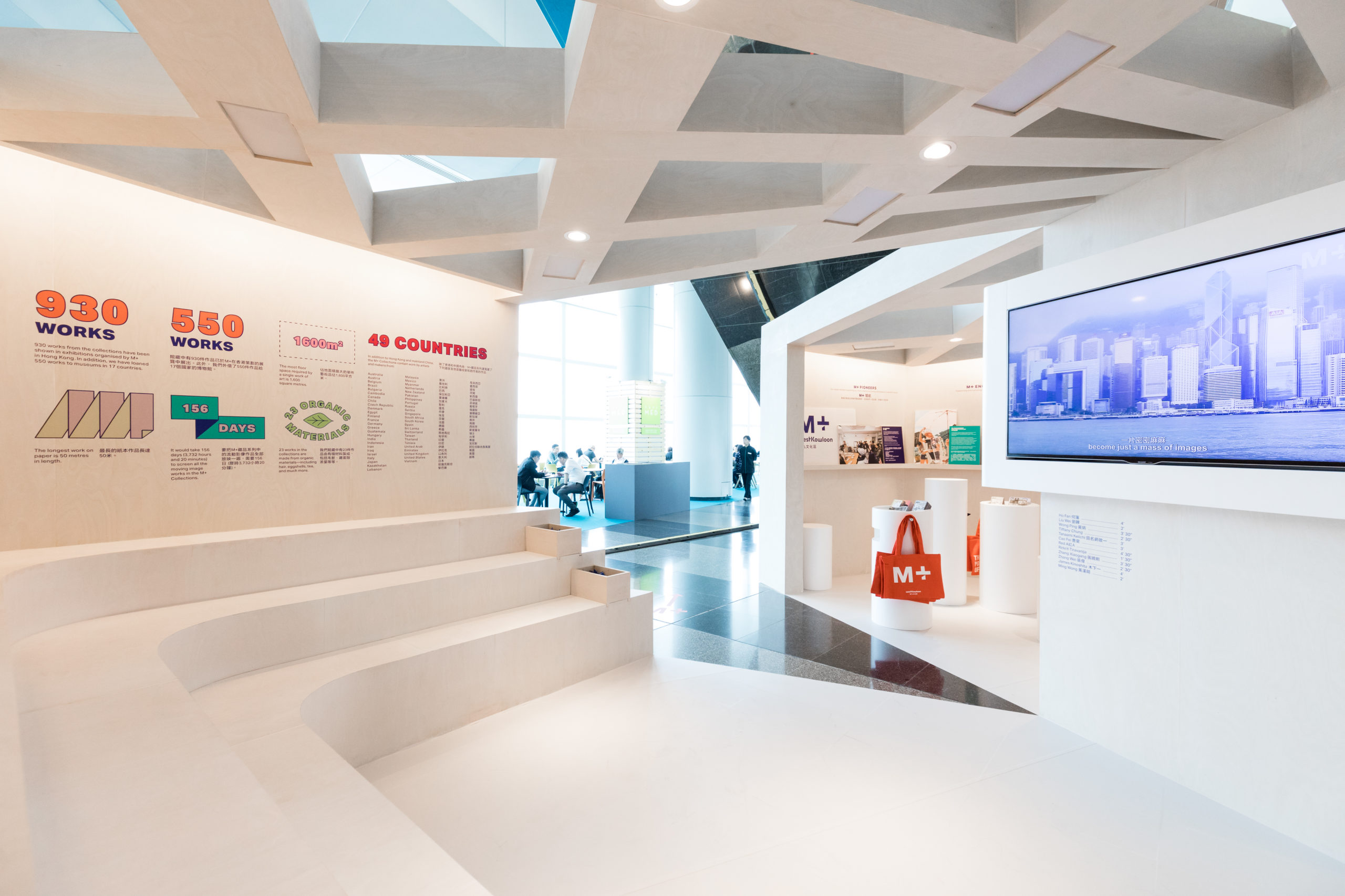
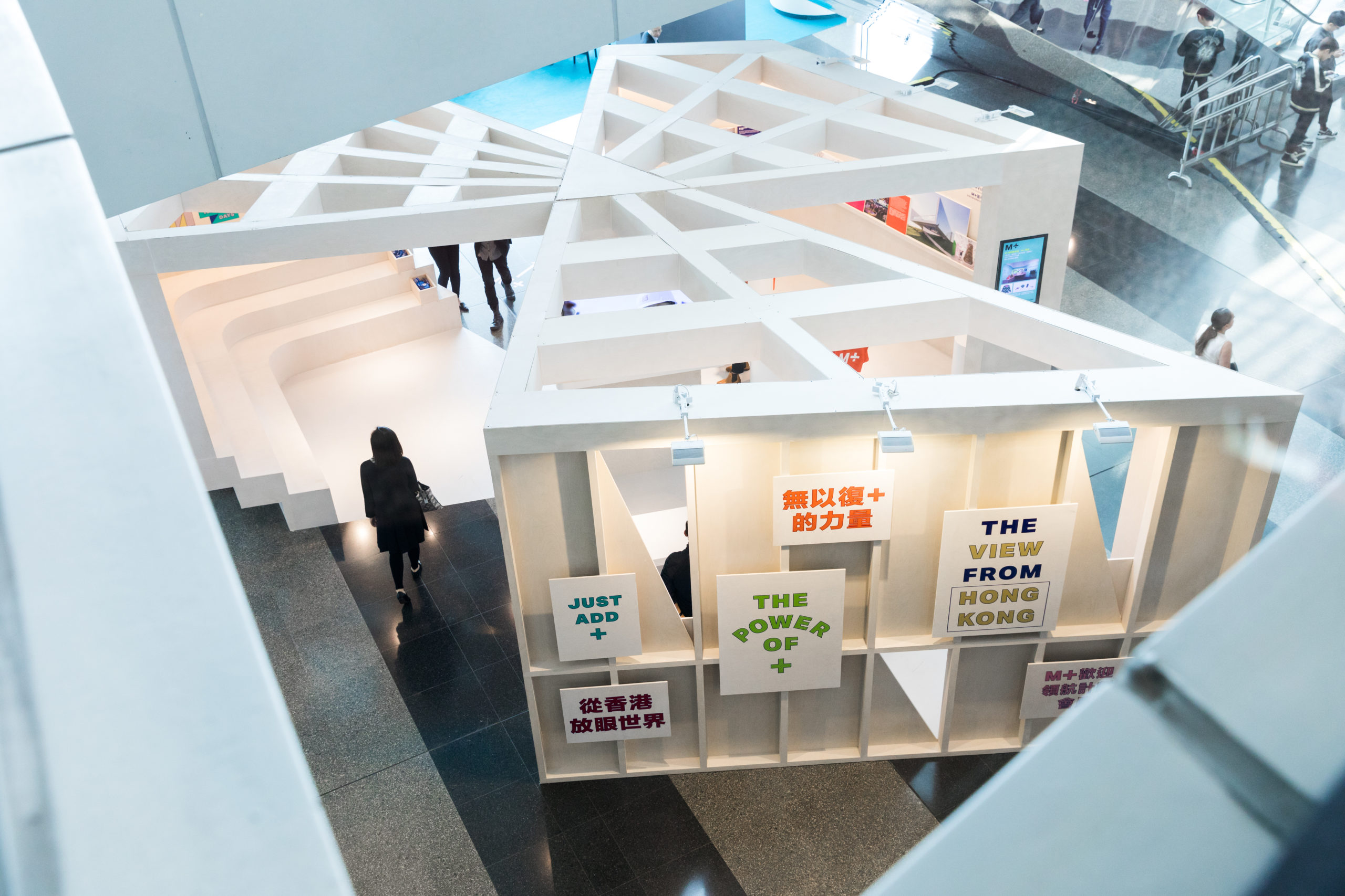
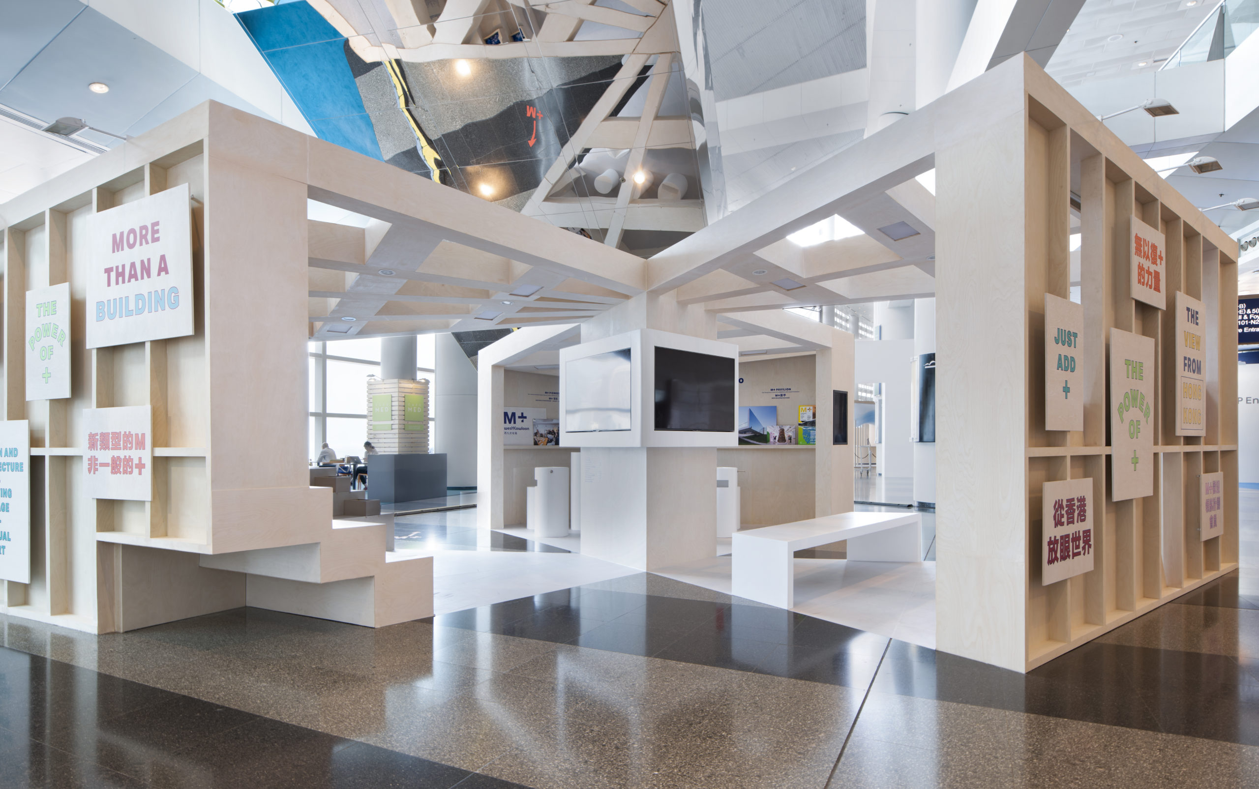
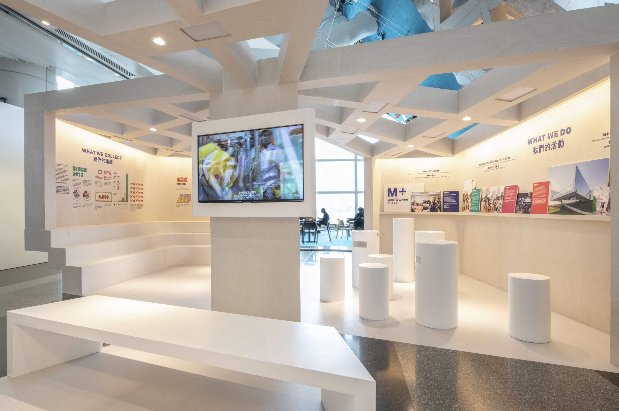
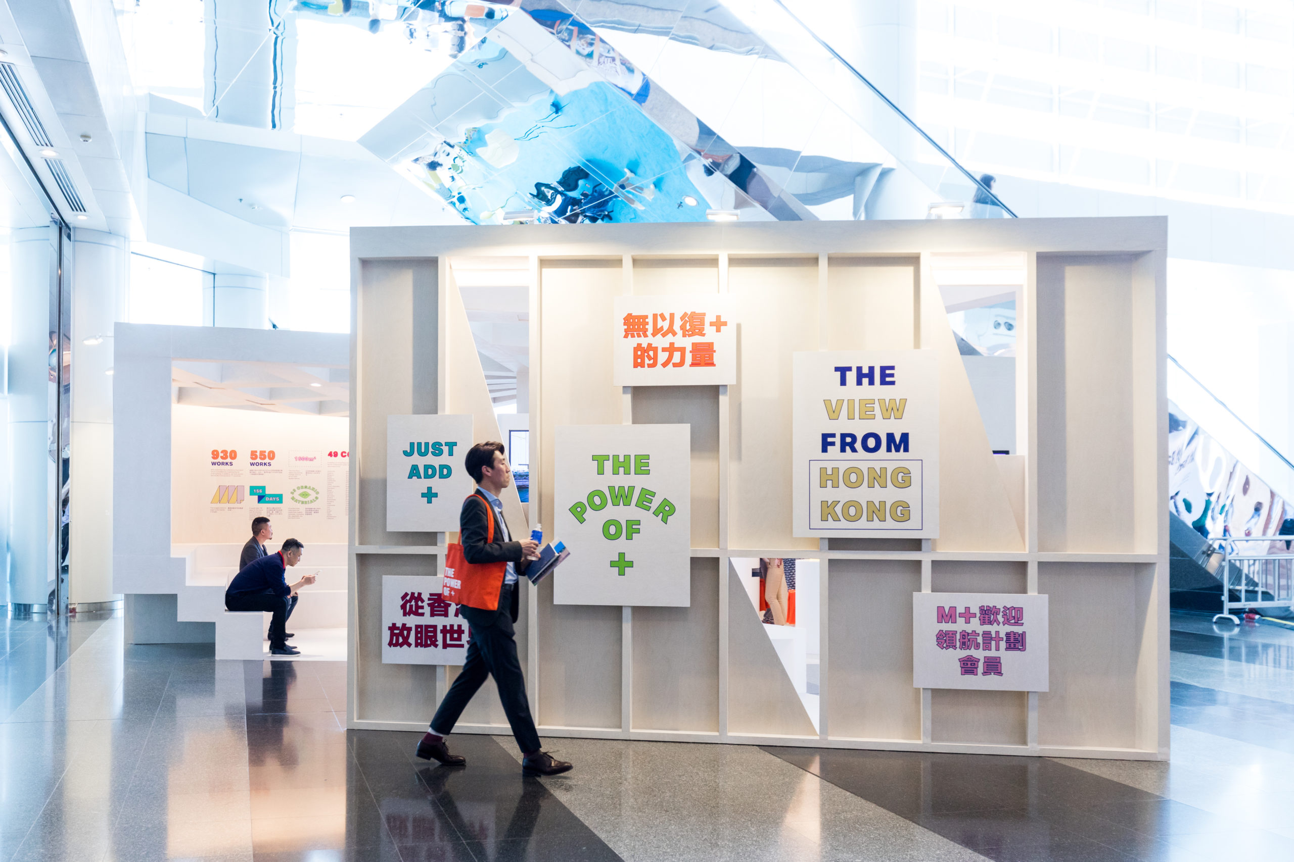
An open pavilion that is accessible to visitors while creating distinct sections to display the elements of the institution and representing the physical nature of the museum under construction. The walls of the booth developed over the design process from simple white walls to something inspired by the idea of concrete moulds: plywood shells used to shape concrete and other materials. This was also inspired by the idea that the museum is still being shaped, formed, and created.


Team: Erik Amir, Dora Chi, Pak Wa Lim
Signage: North Design
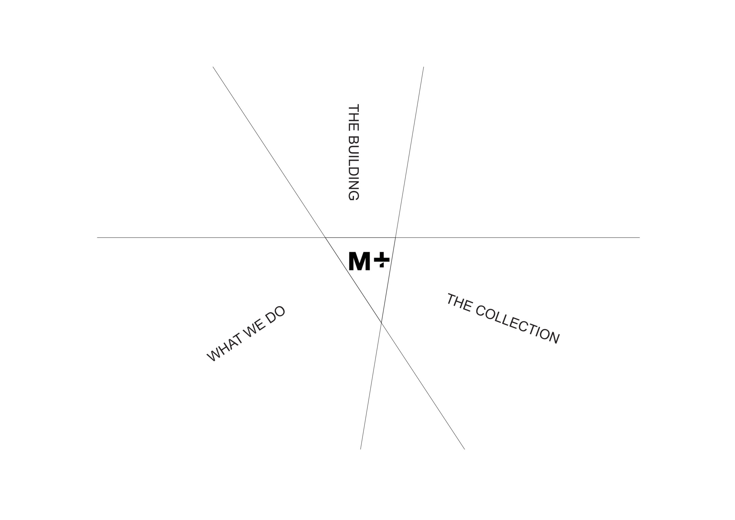
spatial practice architecture office Los Angeles Hong Kong m+ museum pavilion art basel hong kong concept diagram
spatial practice architecture office Los Angeles Hong Kong m+ museum pavilion art basel hong kong cantilever mini theater
spatial practice architecture office Los Angeles Hong Kong m+ museum pavilion art basel hong kong concept model

The temporary nature of the Art Basel event was also taken advantage of to heighten the materials—rather than being painted white, the walls were made out of whitewashed plywood (painted with a thin layer of white paint and sanded), creating a soft and raw surface that still looked refined.

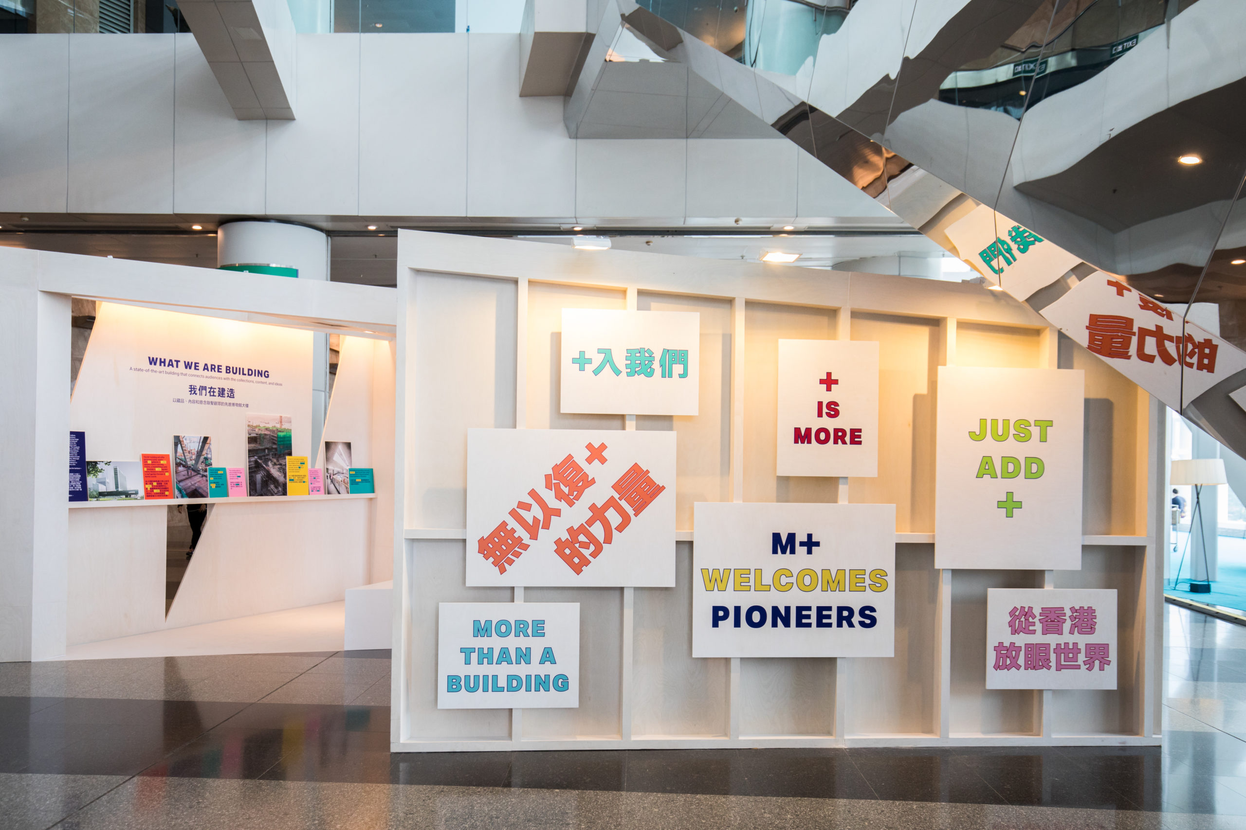
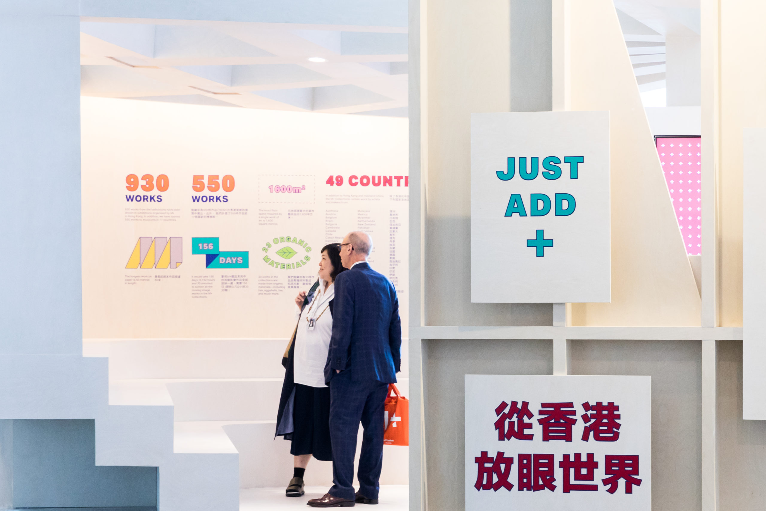
Another important element of the pavilion was the contrast between the walls and the strong, colourful graphic design elements. On the outside, colourful and catchy ‘slogans’ were created to catch visitors’ eyes as they moved through the busy Art Basel floors.

spatial practice architecture office Los Angeles Hong Kong m+ museum pavilion art basel hong kong point of views
spatial practice architecture office Los Angeles Hong Kong m+ museum pavilion art basel hong kong the pavilion